Showing posts with label Spring. Show all posts

Friday, March 20, 2015

Spring/ 2015

Photography: Studio Marcus Hay Inc


It may not quite feel like it, especially up in MA where S.M.H is currently but today is the first official day of Spring in the U.S, Here's to the thawing of snow, birds and butterflies! Happy Spring all from Studio Marcus Hay​ Inc

Saturday, February 14, 2015

CB2 Spring/ Drop 2/ 2015


Photography: Jonny Valiant, Styling: Studio Marcus Hay

Photography: Jonny Valiant, Styling: Studio Marcus Hay


Photography: Jonny Valiant, Styling: Studio Marcus Hay

Photography: Jonny Valiant, Styling: Studio Marcus Hay

Photography: Jonny Valiant, Styling: Studio Marcus Hay

Photography: Jonny Valiant, Styling: Studio Marcus Hay


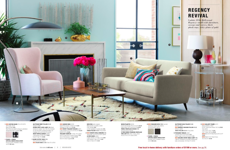
For the second drop in the CB2 Catalog, more work from Studio Marcus Hay is featured in the latest issue in stores now. Already featured in a past post on Fluff N Stuff, this is the remainder of new images that can be seen either in the catalog or online for Spring, 2015. 

Working on a number of themes, some including Hollywood Regency and also a new take on Industrial, Studio Marcus Hay worked in November, 2014 with Photographer Jonny Valiant in Chicago in the Crate & Barrel Studio.  

Working with an amazing team we created multiple sets over an number of weeks, up to 4/5 sets can be up at once and when a particular shot is finished and approved, another set takes it place before you know it, it is quite a process and it's important to be super organized and ready to produce a whole new story per set as you go. Studio Marcus Hay is used to thinking on their toes and readily embraces the challenge.

We hope you enjoy the results.  

Thursday, January 8, 2015

CB2/ Spring Preview 2015

Photography: Jonny Valiant, Styling: Studio Marcus Hay

Photography: Jonny Valiant, Styling: Studio Marcus Hay

Photography: Jonny Valiant, Styling: Studio Marcus Hay

Photography: Jonny Valiant, Styling: Studio Marcus Hay

Photography: Jonny Valiant, Styling: Studio Marcus Hay

Photography: Jonny Valiant, Styling: Studio Marcus Hay

Photography: Jonny Valiant, Styling: Studio Marcus Hay

Photography: Jonny Valiant, Styling: Studio Marcus Hay

Photography: Jonny Valiant, Styling: Studio Marcus Hay


Back in November last year, Studio Marcus Hay spent 3 weeks in Chicago with CB2 working with them on the Spring Catalog. They have just released the Spring Preview which is a smaller version of the Catalog as a whole, we will share the rest with you at a later stage but for now you can get a taste of the work we produced with the wonderful Photographer and regular collaborator Jonny Valiant.

CB2 have some new themes which we explored included Hollywood Regency and in general the images we strove to compose where luxe, rich and sophisticated over all categories. It was a lot of fun to explore a genre close to my heart. Thanks so much for my team of Assistants Ronnie, Miriam and Sandra who helped pull it all together. 

Look out for more work with CB2 in the not too distant future. 

Sunday, April 27, 2014

Williams Sonoma/ Spring May Catalog

Photography: Con Poulos, Styling by Studio Marcus Hay

Photography: Christine Schidhofer, Styling by Studio Marcus Hay

Outakes: Studio Marcus Hay's Instagram pics of George Dolese's Food for the shoot

Photography: Christine Schidhofer, Styling by Studio Marcus Hay

Photography: Christine Schidhofer, Styling by Studio Marcus Hay


For the latest Williams Sonoma Catalog, Studio Marcus Hay flew once again West to work on the May Catalog focusing largely on Mother's Day. Working largely on the knives section, S.M.H decided to take a graphic approach. The season is Spring so Food Stylists George Dolese and Alison Attenborough worked in some beautiful Spring produce, In the mix we also got to shoot a lovely Spring Soup and other kitchen utensils.  

Photography is by the wonderful Christine Schmidhofer and Con Poulos 

Wednesday, March 26, 2014

Floral Fever/ Spring, 2014


Left: It's Springtime at Studio Marcus Hay, Graphic designed by Studio Marcus Hay, Vintage Watercolor
Right: Still Life with flower from Interior Project, Kess Agency, Photography: Jonny Valiant
Styling: Studio Marcus Hay

Left: Floral Graphic designed for Studio Marcus Hay by Christina Holmes
Right: From New York Stories series, Photography: Kat Teutsch, Styling: Studio Marcus Hay

Left: From New York Stores series, Photography: Kat Teutsch, Styling by Studio Marcus Hay
Right: Real Simple Editorial, Photography: Sang An, Styling by Studio Marcus Hay

Left: From Flower Shower series,
Right: From Marcus Hay Interior, Photography: Hallie Burton, Styling by Studio Marcus Hay

Left: Copenhagen Roses, Right: Roses at NYC Flower Market, Photography: Studio Marcus Hay

Left: Paper Flowers for Better Homes & Gardens Project by Matthew Sporzynski
Right: San Francisco Magnolia, Photgraphy: Studio Marcus Hay

Left: Fern dyed purple at NYC Flower Markets, Photography: Studio Marcus Hay
Right: From Interior Project, Kess Agency, Photography: Jonny Valiant, Styling: Studio Marcus Hay

Instagram shots by Studio Marcus Hay

Left: From Flower Shower series, Photography: Hallie Burton, Styling by Studio Marcus Hay

Left: V&A Museum tray, Right: Columbia Rd Flower Markets mural, Photography: Studio Marcus Hay 


Here at Studio Marcus Hay, after the long winter we always delve into spring and embrace our love of flowers, This Spring is no exception. We are currently on the West Coast and spring has probably sprung into action earlier here this year. The birds are a chirping and the flowers are a blooming.

Flowers and plants always play a big part in the success of a shoot, There are not many times that we don’t find ourselves in need of them. Early morning visits to Flower Markets and Nurseries are commonplace and we often bump into fellow Stylists fighting for the best bunch of peonies. It has always been interesting to me how you can have a guttural response to nature and how when creating images, the inclusion of an organic piece elevates the shot without a doubt. I don’t know many people who have a hate of the organic.

Here is a medley of shots over the years that Studio Marcus Hay has produced and styled, As you can see we are not shy of flowers, naturally not all these flowers are Spring flowers, the beauty of flowers is that you can get different types year round, but with the celebration of spring in mind, Here is a mixed bag of flower inspired shoots and influences.

I just got back from England where sweet floral’s are abound, From The V&A Museum to Liberty Store to Columbia Flower Market, I am not sure if I was on Spring alert but it was so great to see the influence of flowers be some prominent. 

Tuesday, January 7, 2014

CB2/ Spring Catalog Continues

Photography: Steven McDonald, Styling: Studio Marcus Hay

Photography: Steven McDonald, Styling: Studio Marcus Hay

Photography: Steven McDonald, Styling: Studio Marcus Hay

Photography: Steven McDonald, Styling: Studio Marcus Hay


Imagine my delight when I see the CB2 images I styles for The Spring Preview for Editors actually also made it into the actual CB2 Catalog for Spring, including the cover which is also an out-take of a composition I came up with for the Spring Preview. 

This time the images are seen even larger which is great, It was great to help set the tone and mood of the Catalog from the beginning and seeing some of the sets used again in other shots, These images were also shot by Steven McDonald.  

Saturday, March 19, 2011

Spring into action

Osbourne & Littles Peony from the V&A Botanical Watercolor Collection
Amelie sofa in "Blazing Poppies", Sethunya sheet set, Part of Anthropolgies current range
Chelsea's Highline, Street Art outside Comme De Garcon, Prop Table for a Spring inspired story,
Photographs: Marcus Hay
Painted motif, Cafe in Berlin, Roses in bloom, Photographs by Marcus Hay
It's a small World, DisneyLand, Photographs: Marcus Hay
It's a small World, DisneyLand, Peonies and Garden Center Florals, Photographs: Marcus Hay

Magnolias oustide a townhouse in NYC, A Fashion set created by moi, Store Display in Anthropologie,
Photographs: Marcus Hay

In the USA, The first official day happens tomorrow, March 20th. And even though right now I am on a job in New Hampshire where there is still a lot of snow and not much signs of tweeting birds, I remember when I left New York last week you could feel and hear it in the air!  Always love that feeling, it’s like a new dawn or awakening…Until the Spring allergies set in at least! : )

To many people in the industry you would know that Spring was shot last year (Probably around Fall) already! It’s always hard to find all the variety of flowers to prop with at that time of the year but right now you know there is going to be abundance, Ironic that we are shooting Fall now! However I am still inspired by the celebration of the season around, In New York, flowers appear in pots everywhere, The Highline in Chelsea (My backyard) is blooming with new promise.

The main thrill for me is seeing Magnolia or Blossom sprout on trees outside, walking through the streets and being slapped in the face by that burst of pink! In stores such as Anthropologie, www.anthropologie.comthe window displays are amazing and never cease to inspire. Never shy of a floral, they really embrace the season.   

I was recently in L.A where we took my 3 year old goddaughter Jaiya to Disneyland, Her favorite ride (and mine!) is Small World, Designed under the direction of Art Director Mary Blair, 1911-1978, http://en.wikipedia.org/wiki/Mary_Blair. Mary and her team designed it in 1964 for 1964 New York World's Fair UNICEF pavilion as a gift to the children of the world, It was then moved to Disneyland in California in 1966 when the Fair finished. The aesthetic is very 1960’s and the flower motifs seems to dominate the ride, I love that the park has kept this ride which seems to encapsulate that era and it’s love of floral motifs.


Even though personally I probably lean towards a more graphic masculine interior, I really do love working with florals integrated into an Interior in a more contemporary way, Oversized florals are great used in wallpapers or fabrics, but even something as simple as a one variety bunch of amazing flowers will guarantee an automatic response, Us humans are programmed to respond to flowers, I don’t know a person who can’t appreciate their majestic allure. 

Tuesday, February 16, 2010

Spring has Sprung/ BH&G's March 2010 cover


One of my regular client, "Better Homes and Garden" recently asked me to help them produce their covers. Of course I have had quite a bit of experience with this in the past, having produced all of the "Real Simple" covers while I was there between 2006 and 2008. I also have also worked on many Australian magazine covers prior.

There is a process when it comes to covers, the approach to them can be quite different then a regular feature. The magazine for obvious reasons is highly scrutinized and deliberated by all. Often focus groups can even be called upon to determine the outcome of which cover will run. Therefore a lot of options need to be produced to make sure every angle is covered, Often 2 ideas or more will be shot in many different ways and then it is left to the higher powers or the readers to decide. There are a few rules to follow: often the cover needs to reflect the season it is coming out on the new stands, It needs to also be an "easy read" and jump out. The choice of colors is important, I find the choices of colors are really what drives a covers success at times, but of course the image also.

To give you an idea, "Better Home and Gardens" is the nations third largest magazine in paid circulation and sells 7.6 million copies per month in the U.S.A. As they claim "Better Homes and Gardens delivers more potential buyers than Country Living, Architectural Digest and Martha Stewart Living combined" It's average age of it's reader is 49 years old and 78% of them own their own home.

With such a large circulation, It is very important that the right image is chosen. My approach is to start the process by working with an existing theme in mind, Often the magazine will give me a few words like "Eat Healthy Kitchen" , "Spring Clean" or "Summer Entertaining" to work with. Sometimes they have a clear idea of what they want to represent this and sometimes they look to me to come up on a fresh take or new ideas all together. In these images represented on this post, you can see an initial pull of 4 out of 6 different ideas that I sketched up. These are reviewed and then I move forward with reworking the favorites or even sometimes a whole new idea. I will then sketch a further 12-16 new ideas and eventually 2 will be chosen from the presentation. I then work through the colors by presenting color chips and when these are also approved, I then go propping. In this post you can also see here some ideas with actual props beginning to formulate at one of the Prop Houses.

With this cover we wanted a quick easy centerpiece or decorating idea that the readers could do with flowers. The cover comes out at the launch of Spring so the flowers and colors reflect that. My idea was to use an eccelectic collection of cups and saucers that most people have even perhaps in the back of their cupboards and stack them on top of each other to form different heights and shapes. The idea also alludes to a "Garden Tea Party", common in Spring. As a second option we also shot a version with cylinder vases combining vegetables and flowers. The cup and saucer version was however chosen and then it was liked so much that an accompanying story was published inside with some of the overs from the shoot which was great as many times the other options are never seen.

In the end the image chosen was by coincidence most peoples favorite who worked on the shoot, It was very exciting to see it on the new stands when it came out last week, I hope you enjoy the nod to Spring, especially when a lot of us are knee deep in snow.

This cover was shot by the wonderful Kate Mathis www.katemathis.com, who I have the pleasure of working with quite often, She insisted on doing a version backlit on this set up which ended up being the one that ran, It was a good call as the lighting is beautiful, I am sure you would agree.