Sunday, January 31, 2010

Is this the Future?...Again?


“The Future”, Is this not what a stylist is supposed to tap into?...almost like a “chic metered clairvoyant”, are they not developing a visual language that constantly shifts? When I first started styling, I used to think that was “it”. Seeing “Styling” as almost a spiritual experience might be taking it a bit far, but I have always believed by nature, people that are attracted to Styling as a serious career, often do it, because their sixth senses are tuned that way, predicting trends and putting something in place months, sometimes years ahead that will seem fresh on its final complete arrival is a skill that not everybody has.

I don’t want to sound cynical but my initial interpretation of what Styling was, is not always one that is understood or even sought out when you take on some projects with some commercial clients, sure they expect you to bring a fresh edge, that is expected on some level. However the sometimes “inspiring” or sometimes “uninspiring” challenge can often be how to make something that can be "derivative of the past" look fresh and glowing yet again. How far does the client want something to really look fresh and how often do they want the same thing with an unnoticeable twist? Do you as a stylist decide to simply just churn it out and deliver something with a big pretty bow on it or do you add that "little something" that client may not understand but knows it’s there? “Pushing the envelope” is something that can be appropriate at times, but often it’s not appreciated if it was not asked for, that’s what you have to weigh up every time you take on a new job.

Some could argue that the whole industry has forgotten how to be “future forward” Is it these economic blues that have forced us into wanting “safe” Are Editors and Art Directors, Designers, Stylists and Clients all afraid to take a chance? In some ways you could think so. With the arrival of a better economy, will that inspire new revolutionary ideas like those that seemed to happen in big shifts over certain decades of the past? It is interesting as we evolve how we do look back at era’s and put them into compartments, on a shelf in neat folders labeled “The Fifties”, “The Sixties”, “The Nineties” etc, we seem to look back not forward so often, like revisiting a familiar friend who is not necessarily representing a new phase in our life but could never be gotten rid of, there is too much nostalgia!

And then there is “The Future”, a theme in itself. All through those decades mentioned, we have had an interpretation of “The Future”, In a very tight nutshell, In the Fifties it was flying saucers and men from mars, In the Sixties, It was the Spanish designer Paco Rabanne and his silver disc dresses, Andy Warhol’s silver "Factory", The Seventies was “Star Wars”, In the Eighties, It was “Back to the Future”, In the Nineties, It was the impending new century, the year 2000! Now we are at 2010 before we know it and we still question what is “The Future” particularly in design and our visual language, the phrase “Futuristic” seems often to be one that is stamped onto anything high gloss, pure white and silver, but are we still creating our concept of “Future” by simply “branding” it still or are we finally believing it?

One of the biggest evidence for what I saw in a city changing and moving towards the future is when I take a walk along The Highline in Chelsea in NYC, An almost futuristic park built on the raised discarded train tracks of another era. It’s here you see glimpses of buildings that seem to embrace this theme of “The Future”, but I can’t help thinking, will we look back at them and see them like we see the Sixties cartoon, “The Jetsons” as an amusing interpretation? Part of me hopes not, because to me these buildings are incredibly beautiful and stand like new beacons of hope and pride, but in some ways they still do seem reminiscent of iconic “Futuristic” buildings like Eero Saarinen's terminal for TWA at JFK or French architect Roger Taillibert’s Olympic Stadium in Montreal, A couple of these amazing buildings that have sprung up are HL23, by NMDA Inc, www.nmda-inc.com and of course Frank Ghery’s building for IAC. More evidence can be seen in furniture in recent years, Some examples I love are Richard Hutton’s “Cloud Chair” made of nickel platted polished aluminum and Jean Marie Massaud's daybed from the B&B Italia furniture collection from 2008, both that feel exciting in their silhouettes.

For me as a humble Stylist, I would one day to see society embrace new design and be excited to move into a new era instead of always playing it safe, we need to find those mediums in a commercial world like artists and designers do constantly in their worlds, Otherwise it makes it harder for creative people be the fore runners of a brighter future when we re always just polishing up the past.

Thursday, January 28, 2010

Yummy Mommies


Adding fruit and vegetables to food in unexpected ways, blueberries to hamburgers, spinach to smoothies, pears to squash soup, you get the picture. Fit Pregnancy is a West Coast magazine that caters to women carrying, about to or with kids already. It was the first time I worked for them and the first time I worked with David Prince, the Photographer. I was very excited to work with David as I have admired his work for many years, you can see more at www.davidprincephotography.com. I particularly like his personal work, a lot of which adorns his wall of the studio in grids of small printouts. He and I share a love of objects and a bower bird approach to collecting, particularly Danish ceramics, but unlike me, once he photographs something or owns it for awhile he often does not feel attached to it anymore, maybe I should take a leaf out of his book, It would save a lot of money on storage fees that is for sure!

We took a very natural approach to this shoot, I wanted to use dyed linens, having just discovered a whole lot of them at Elephant Props, We wanted to give it a light and dark feel, Some backgrounds cream, other darker and moodier, but weaving in hits of green and orange, much of which came through the food beautifully styled by Megan Schlow.

It is a relatively small story, short and sweet.

Thursday, January 21, 2010

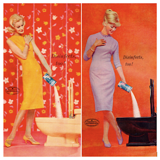
Flashback, The American Home Magazine


My work schedule does not permit me to watch much television, so I don’t get to have those excitable conversations with other people about what we watched last night on T.V. I suppose if I got in line with technology I could TVO everything but really, I don’t think I could ever find the time to watch that backlog of programs either. I did however recently find myself stranded in a airport hotel caught in an ice storm in Iowa, holed up in a tasteless room made of total polyester and crusty carpet, there was not much to do but look out the window at the icicles forming at a an alarming rapid rate on anything that stood still for more than a few seconds. This was actually quite riveting for a couple of hours but then my attention was drawn to my shining DVD boxed set of “Mad Men” that I bought on a Minneapolis trip many months earlier but never had time to watch, Season 1 mind you! I had caught snippets of Season 3, but at last I had found just the right spot in time to view what I have come to discover is an amazing series – duh!

This overdue discovery of “Mad Men” coincided with the discovery of some old 50’s/ 60’s magazines at the antique markets in NYC the week before. I have to say I have always been a sucker for “The American Dream” A bandied around phrase that really had its peak in the era in which “Mad Men” is set. Of course I have come to discover with age and a cynical edge, that of course the whole concept is pure fantasy but I still love it and I still feed into it! I found copies of “The American Home” which was a magazine published by “Doubleday, Doran and Company” out of New York from 1928 to 1977. It attracted a peak circulation of 3.7 million readers a month in 1963 looked to “The American Home” for inspiration on everything from domestic architecture to landscape design and gardening. The copies I found ranged from 1955 to 1960, exactly the time frame Mad Men’s first series was set.

The thing that struck me mainly about the magazine was its amazing advertising, it really represented a golden age where women in ball gowns and pearls where draped over anything. “The American Dream” grew out of the dark period of the Depression and became a floodlight of totally the opposite, an affluent and glamour obsessed society who wanted to leave the bad times behind them. It soon became apparent that “The American Dream” could be purchased and that “more” is always better! These publications of the era made bored housewives feel meaningful in the mundane existence of Suburbia. The fantasy of being a proud accomplished housewife was pushed and polished. “Feminine mystique” became a huge selling tool in this era and even up to this day still pushes the notion that “sex sells”.

Having grown up in Australia and having been blessed by being given at an early age a whole pile of American LIFE magazines from this era by a friend of my mothers, these ads and publications left an early impression. Having also grown up for part of my life in Suburbia, I also was fascinated especially by the glamour and slickness they seemed to promote. There was crispness; even if a somewhat manufactured sophistication. To this day I am convinced my color palette is totally derived from the colors that bore into my retinas from that early age, That slightly dusty (maybe from obvious aging of those magazines) combination of pastels and almost clashing combinations of color chosen really resonated with me, Having grown up surrounded by my parents choice of decor that almost rebelled against the style of their childhood stylistically, I actually saw a freshness again in the modernity of that era. Some people have parodied the 50’s and early 60’s and hammed up its cheesy values, however if you look at a lot of the design still popular today you can see that a lot of the streamlining and simplicity of that era still has a huge influence on products manufactured today and the continued reissues of iconic pieces from that era designed by Eero Saarinen, The Eames, Alvar Aalto, George Nelson and Arne Jacobsen prove there is no hurry to sway away from the last century’s middle period of design, Let’s see if the next era of designers think so too?!

Watch for future posts of this exciting era of design. As a Stylist, collecting images from all era’s is a must and I plan to keep looking out for these often forgotten gems lurking in piles of discarded piles of magazines. It's a testament that even though magazines can often be seen as throw away medium, someone, one day somewhere will pick them up and see value in someone else’s work and maybe through the Internet we can appreciate these images all over again.

Sunday, January 17, 2010

Behind the scenes, Food and Wine Feb cover


Often I will get asked to do a cover try, sometimes it is a series of cover tries that can be done throughout the duration of a day, This can mean creating different approaches to the same subject matter and sometimes totally different options all together. It is an interesting process and one that only really became familiar to me when I moved to the U.S.

In Australia we often shot something on a shoot if we thought it would look good as a cover but more often than not, a suitable image is chosen from the array of images available from that particular issue being shot that sings as a cover from rest. In the U.S, that chance is not really taken that often, some magazines do work like this and but most will devote a day or two even to get the image they feel is right, This can be based on a whole lot of things, Market research, focus groups or simply what the Editor or higher management like the best. Some argue that it means the image is more labored, not as fresh and spontaneous, but I feel, whatever works for the magazine, The sales on a cover in the U.S magazines cover can make or break it, so there is more riding on getting the perfect formula working for that product than elsewhere, the culture is also different.

For this Food and Wine cover, we actually tacked it onto the end of another shoot, I knew well in advance though so I was able to collect many options for propping and I treated it like a totally separate shoot. I knew we had to shoot chili in a bowl, For non American readers, Chili is a bowl of Chili Con Carne, which literally means "chili with meat" It is a spicy stew that has a long history in the States, Chili Con Carne is the official dish of the U.S state, Texas. It was first introduced in the 1600's and it's exact origins are a bit of a mystery, but seems to be a variation of a Spanish or Mexican dish.

I set up various options that you can see from the behind the scenes shots, My main brief was to use unexpected combinations of color, so I mixed various clashes of color on purpose, treating the palette in almost a painterly way. It is a February issue so in the U.S, It is still Winter, so it had to be evocative of the season as Chili is the perfect dish for this time of the year.

Thursday, January 14, 2010

Market Find/ Art Deco Bust


Recently I was asked to a meeting for a client who wanted me to contribute to the redesign of an aspect of an established business. The business itself is very well known but has a clash of styles that are due to a long history in the USA. Trying to define what was the meshing of all these styles into one identity is not easy, So I hit the books and I hit the markets. Unfortunately for me the job does not look like it is materializing but it was a great excuse to delve into some Design History. I realized that you can never have to many books on the history of design, especially furniture and Interior styles, I thought I knew quite a lot about the subject but I do realize that you really need to consider it a lifelong journey to know as much as you can about the history of design. Opening books that go into the greatest detail about what angle of a leg of a chair represents what years it was manufactured to the exact years and what hybrid emerged from the combination of local and international influences is astounding and so interesting!

Anyway this exercise made me eagled eyed at the antique markets also, All of a sudden I was looking at eras I usually bypass. Art Deco, Art Nouveau, Empire and Arts & Crafts. I started buying William Morris inspired swatches of fabric, Crystal chandelier parts, Art Deco busts, anything that would help me identify in more depth the particular era's that influenced the look of the client's company.

One of these finds included an Art Deco piece from what I have come to have I.D'ed as a 1950's piece. It's Italian, But the interesting thing is it's actually inspired by a whole movement of busts, figurines and masks that were produced by the Austrian company "Goldscheider" Art Deco was an international style that is placed as being strongest from 1925 to the 1940's, however when you look at American culture and the design of it's cars, diners and Airstream Caravans, The influence still reached in the 1950's. This piece seems to be derivative of the style of ceramic busts that had it's peak of popularity in the 1930's, but it was produced in Italy and is clearly marked that way. In these collection of images, I tried to create a mini mood board that may explain the way I see the object.

For me her style of clothes is very reminiscent of the Italian screen goddess, Sophia Loren, her catlike eyes and pearls around her slender neck. It is of course replicated in an Austrian style but seems so much more "Italian" to me in it's styling. She also reminds me of a Tamara de Lempicka painting. De Lempicka was a Polish painter who lived in Russia. Her style was very clean, elegant and precise and know as "soft cubism", She painted mainly figures of women, here in her painting "Auto Portrait" she is seen driving a car of the period. The turquoise color of the hat in the bust I found seems so reminiscent of the 1950's but also the Art Deco movement as a whole, It was a popular color in motifs and architecture of the Art Deco period.

Anyway, I had to have her, she was a steal for the price, I found one on an English auction website that was 7 times the price so maybe she will be sitting amongst my ever growing collection of busts for many years to come. I usually shy away from Art Deco, considering it a little over stylized for me, but mixed in, you can actually appreciate the way it can add some "pure decorative flair" to an interior scheme... however like a lot of things, better less than more!. Too much makes you feel you are living on a Hollywood set of a bygone era.

Tuesday, January 12, 2010

Behind the scenes, Beer and Asian


This post is quite exciting for me, It is the first time I can really bring you a "Behind the scenes" post of a commercial shoot. As most of you would know, magazines are produced at least 3 months ahead so as I started this blog only about 3 months ago, I had to wait until the magazine came out before I could publish these shots. Obviously the Magazine does not want the world to see what is in production before it comes out, that would be a real spoiler and land me in all sorts of trouble to boot!

In these shots I have illustrated the world of the Prop Stylist behind the scenes of a Photo Shoot, Folding tables are our friends as they help us edit through and display all that we need to see just to the side of the set. Jeanne Lurvey, my wonderful assistant on many Food and Wine shoots is seen here sorting through the various props. You can also see a stack of backgrounds waiting in the wings for their possible moment in the light, I like to have these displayed to really reinforce the color palette in evrybodies eyes. You can see a collection of blue and white plates also edited into their own category, ready to be considered for the right recipe.I also like to stage my combinations so the Photographer and Art Director can clearly see what I have in mind for the next shot. Lastly in these shots you can also see the treatment used as the background to many of the shots, the pinned up photocopies of a well known willow pattern from a Chinese platter, I think this is a great idea for a wall treatment even at home, note to oneself!

Hope you enjoy seeing a glimpse into my world, Look for future posts of this kind to come with future projects!

The Perfect Pairing....Beer and Asian Food


Who doesn't like a cold beer on a hot summers day?, Only thing is it's freezing here right now in NYC! Still the idea still sounds quite appealing, especially when you pair it with Asian food! : ) This story was an interesting one to style for Food and Wine Magazine, It features the recipe's and philosophy towards cooking by Chef Sang Yoon, whose L.A restaurant "Lukshon" is a place I will definetly want to visit next time I am there on the West Coast! With food and drink, Sang Yoon likes to blur borders, for example combining Indian with Chinese, throwing in some Belgium Ale! It was largley interesting to style based on the blurring, We decided to not do the cliqued combo of red and black and instead used rich blues combined with a hit of red. In my research, I noted that a lot of Chinese platters and plates do in fact come in the popular blue/ white combination, I managed to buy quite a lot on E-bay and was able to weave in vintage plates with new silhouettes.

Stephen Scoble, the magazines Creative Director had the idea of blowing up sections of platters to use as a background, so my trusty assistant Jeanne spent many hours chained to a photocopy machine producing just the right sized magnification. We then pinned these overlapping each other to create almost a wallpaper effect.

We shot the story with the very talented Tina Rupp, Check out more of her wonderful work at www.tinarupp.com, Food styling by the also very talented Alison Attenborough, www.alisonattenborough.com

"A Beer Geek's guide to Asian Flavors" appears in the Feb issue of Food and Wine Magazine.

Look for the behind the scenes on the post to follow.

Saturday, January 9, 2010

Tile Work it!


What can I say, I like tiles! Part of my job requires me to source tiles backgrounds all the time so I look for inspirations on the streets and on buildings everywhere I travel. Everywhere I go, I make sure I snap tiled walls, they intrigue me. I think largely the appeal comes from a nostalgic place where in my childhood, I remember being surrounded by different tile samples that mother collected for her interior decorating projects. I used to collect them as a child and marvel at their different glazes, colors and shapes. Of course when I travelled to Barcelona later on, I was in tile heaven. Antonio Gaudi 1852- 1926 , the famous architect whose work I consider almost out of this world blew my mind away, especially in his project Casa Batlló, 1905–1907, (which means "House of Bones") where all in the entrance hallway and stairs of this house the most amazing example of tile work I have ever seen.

I have seen many beautiful examples of tiled murals from the 60's and 70's and considered outdated be covered up or destroyed in what developers probably consider "face lifting" an older style buildings, particularly in Sydney, where often there is a lack of appreciation of these artists work. There is one building in Surry Hills that still retains and amazing example of tiled work which I wait in dread to see somebody consider outdated and thus removed. I really hope that with many of these mid century examples of tile work there will be a movement to see them preserved by law.

These examples of tilework come from many different places, Sydney, Australia, Montreal, Paris and New York.

Sunday, January 3, 2010

Back to Storage


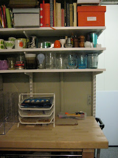
So awhile back I promised you all that I would show the results of my new prop cupboard, It's safe to say, really that it's a constant work in progress, One things for sure, It is never going to stay this neat! When you are a Prop Stylist, Props come and go, Things get broken, things get old, things need to be chucked and things need to be included, It never stays the same.

It has been a couple of months now so I apologize for not getting it up sooner! Really though, It was those couple of months that I needed to build metro shelves, sort out a configuration that suits a small space that needs to house a lot of stuff. I also wanted a distinct wrapping area, and a bench to lay out things as you come in the door. My last space was a small long corridor and hard to manage so now at least I can walk around the space and pack in there instead of outside in the actual corridor in the way of other storage dwellers and their carts.

The space is located in a lock up storage unit so it gets a bit gloomy, I installed extra lights and also put in an I Pod dock so at least my assistants and I have something to listen to as we spend many hour a week in there packing, unpacking, packing, and unpacking, It can get a bit repetitive. The bonus with this storage unit is that I get an electrical outlet, My last one bordered on being night time all the time, so a little spark goes a long way in making a difference! I feel like a caveman who just discovered fire.

Things are divided in categories of course, All my tabletop props such as plates, bowls, glasses, cutlery are all in one spot. There is a place for vases, a place for holiday decorations, a place for toys, books, stationary, fabrics, gardening, statuettes, bathroom accessories, shells, birch logs, frames, you name it, It's in there somewhere.

My prop cupboard really acts as a more "basic" resource, If I know I have something, It can save hours looking for that one object. With Styling it's all about trying to fit the impossible timing wise into a small window of time allotted to each job. You really do need to have systems in place and be super organized to make sure if that client wants that polka dotted, not too big, not too small, kind of red, but maybe orange bowl with a contrasting colored interior and matching under plate, you have better got it!