Monday, March 29, 2010

Spring clean, Is it that time of year again?


Every Spring, that old "Spring Clean' story comes riding up on it's fresh white horse and as a Stylist you need to jump in the saddle and with spray bottle in one hand and a scrubbing brush in the other, reinvent, re inspire and revisit ways of presenting cleaning as a fun and fulfilling activity that one must do. I am not sure if it comes with part of the job, but I have to agree, nothing beats a gleaming white tile and that star burst that emanates from a fresh scrub, in other words, I love a spring clean, summer, winter and fall too!

Shop Smart is a magazine that is amazingly free of ads and is published by Consumer Reports, www.consumerreports.org. Consumer Reports, owned by the non-profit consumer advocacy group Consumers Union, receives some grants from foundations and individuals. But it’s run mostly with money from subscriptions to the magazine and its website. This is my second cover I have styled for them. As I have often stated, a cover requires many options, and for this cover we tried many different bathroom sinks, mirrors and wall options. Working with a clean palette of white, orange, blue and yellow, Shop Smart Magazine like to keep their covers simple, direct and to the point. Their reader wants to be informed about the best and most responsible consumer choices with a quick and instant read on the cover and so the end result best reflects this. Their tag line is "No Hype + No Ads + Just Great Buys"

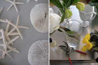
From the behind the scenes shots, you can see various prop ideas that lay out on my tables, We explored everything from different flower arrangements and other alternative botanical references such as shells, plants and even coral. There had to be some reference to actual cleaning products in the shot, so we had a mountain of different scrubbers, cloths and cleaning products on hand, It was a fanatical cleaning frenzy!

Monica Buck, www.monicabuck.com is a photographer I have had the pleasure of working with for quite some time, Her and I have shot 2 covers and a feature for Shop Smart.

Saturday, March 13, 2010

1958, A time capsule in Food/ Continued


There are so many great images, I could not contain them to one post, Hope you enjoy more of the pages featured.

1958, A time capsule in Food.


When I am in Minneapolis/ St Paul in Minnesota, which seems to be quite often these days, It’s in the Mid West that I discover the most amazing finds in terms of second hand/ vintage stores. In St Paul I visit the Saint Paul “Retro Loop” which as they say on their website “is a consortium of 5 of the best mid-century shops in Minnesota specializing in the coolest 50s–80s house wares, accessories, fashion & design” www.stpaulretroloop.com.

One of my finds this time while browsing through an old book section was “Picture Cook Book” by Life, published in 1958. This book I have come to discover was pretty much a staple book from that period. Published out of New York by Life of course, the picture stories featured in the book are made up of images featured in “Life Magazine” between 1951 and 1958. It’s no lie that I am fascinated by that period in history, mainly because everything seemed so crisp and new, even as I glance through a book which is over 52 years old, I can still see the formulas used or rediscovered that you still find in publishing today. Some of these pages look like they could have been taken directly from such magazines as “Bon Appétit” or the dearly departed “Gourmet” Magazine. Of course the food looks a little “stitched up” at times, but the graphic quality and some of the “quirky” ideas that are used are very interesting to me as a Stylist.

The Art Director credited in the book is Charles Tudor, His use of typography in the book and it’s clean layout really do mirror a time in design history where attention to detail was at it’s peak. He was however a man beyond being just an Art Director and was extremely dedicated to many humanitarian ideals, Before “Life Magazine”, During the depression years of 1935 and 1936 he went to work for the Rural Resettlement Administration in Washington and he worked with an extremely talented group of writers and artists, all of whom shared a conviction that their talents could affect a positive change on American society, From there he moved to the newly founded “Life Magazine” where he worked for 21 years. In 1945 he was actually named art director and by 1955 he had, literally, changed the face of the magazine introducing new typefaces he designed himself. With the advent of the portable 35mm camera, “Life” was the first magazine to make use of it and new techniques in printing and papermaking. The result was the reproduction of photographs of unrivaled quality for a mass-produced magazine. Charles Tudor indeed helped to usher in a new era of photojournalism. He died in 1970, at age 66.

Some of the Photographers whose images are represented such as Ben Rose (1916-1980) who with Irving Penn was part of the “Philadelphia Group” that had studied with the famous Art Director Alexey Brodovich in the 1930’s and Leslie Gill (1908-1958) who actually started as an Art Director on “House Beautiful Magazine” who unsatisfied with the ability of staff photographers to translate his ideas to images, started to photograph himself, he also worked with Alexey Brodovich helping to revolutionize approaches to graphic design. His photographic work also featured in “Life, Harper's Bazaar, McCall's, Town & Country”, and “Holiday” Interestingly he collected artwork, memorabilia, and found objects for use in his work, creating relationships of shape, tone, and tactile properties of the objects he photographed. Other Photographers include Arnold Abner Newman (1918-2006) and Edgar de Evia (1910-2003), All legend Photographers that have sadly passed but contributed so much.

Adolph E. Brotman decorates the end papers with wonderful graphic illustrations of whom I can’t seem to find much information, although he does seem to have illustrated a lot of government literature via pamphlets and books and many magazines.

It amazes me how you can open just one book and so much history and peoples careers seep out of it’s pages, People in our industry that had amazing careers and the evidence is here in only one book. With the advent of digital technology, will we be able to keep in our hands the evidence of a body of work or will all future work flip off like a switch and disappear into digital heaven? Food for thought!

Tuesday, March 9, 2010

Film Noir Inspiration/ Photographer Erwin Olaf


I first came across Erwin Olaf’s work while browsing through one of most New Yorkers favorite haunts, The Strand Bookshop, It was his self titled book by Aperture, I just thought the subject matter and of course as a Prop/ Set Stylist, the sets were so inspiring, I had not really seem anything like it since David Lachapelle or Nick Knight. Of course Erwin’s work comes from a different place, its icier and almost uncomfortable, but at the same time hauntingly beautiful. Largely his images seem to illustrate such emotions as loss, loneliness, and quiet despair, It seems, Erwin plays games with the idea of cold reality versus cruel artifice, capturing that precise moment when innocence, hope, and joy are lost. His images that stuck a chord the most with me in this book were the “Grief” series where work offers a blend of mid-century modern and noir aesthetics seen through a contemporary, fashion-inflected lens. Sad women sitting, standing, stuck in a gaze of disbelief.

My interest again was fueled on my recent run through the Chelsea galleries in my neighborhood in NYC, I came across his current exhibition showing at Hasted Hunt Gallery, On the Art scene Hasted Hunt also represent him in the U.S, see www.hastedhunt.com. The first part of the exhibition “Dawn/Dusk” is a mixture of very light/white composed images and very dark/ black images. In this series of the exhibition, there is a mixture of room views and still life, The sets/ location are so detailed and with their monochromatic approach, almost layered with intensity but with their lack of contrasting colors, also subtly at the same time, He explains it as “I still love time travel—I wanted to go now to 1900. Photographs of African-Americans from 1900 inspired it. This became “Dusk.” It turned out after completing that series I went to Moscow, and as I checked into my hotel I saw a very pale white woman with very pale white children in a black and white versus color, left versus right, right versus left—the two form a mirror series”

The second part of the exhibition is a series of very beautiful people in various states of undress in different hotel rooms. Some opulent, some almost Motel-like, in color and tone they are reminiscent of his “Grief” series as mentioned before.

All his sets for his work are built in his studio in Amsterdam. He works with a team of set designers, costume designers, stylists and of course makeup, and hair. Inspired by the movie business, In particular the 1950s and 1960s where many many films were set-built and shot on that location, Erwin’s aim is to capture a fragment in time, as he says; “So you can idealize your world and really make your dreams come true for one second in photography…it’s a very precise procedure to create this dream world, or nightmare”. To design sets like these would be a dream job for me, To have to the opportunity to research a time period and work through such strong concepts with such purpose would be very fulfilling for someone in my trade.

Erwin was born in Hilversum, in the Netherlands; He currently lives in Amsterdam but also works internationally.

Bernstein and Andriulli represent Erwin Olaf commercially; Look at more of his commercial work at http://www.ba-reps.com/artists/erwin-olaf

Monday, March 1, 2010

Oh those Swedes!/ Olle Eksell


Olle Eksell, many may recognize his work or perhaps it may remind you of a genre that seems to evoke memories of childhood storybooks, they do for me! Olle Eksell was a Swedish graphic designer whose main body of work was executed in the 1950s. He worked as an illustrator, a writer, a branding expert, an editorial designer, a fabric and textile designer. He spent some of his early career in Los Angeles but returned to his native Sweden to be part of shaping graphic design and branding in that country. Olle pioneered many corporate identity projects, which were still a novelty when he started his career. He also designed and illustrated magazines, reports and a line of home wares that still exists inspired by his designs.

It always amazes me that peoples careers and lives, their whole body of work can be sometimes largely unrecognized at least in English speaking countries, Not much can be found in English on Olle but his work is so distinctive and really speaks in volumes about an era that is so revered and admired once again. When you look at the work of Andy Warhol from this same period when he worked as an illustrator for Bergdorf Goodman in the 1950’s there are parallels. Also the work of Paul Rand, another famous American graphic designer and of course Alexander Girard, whose branding and textile design of the same era I first discovered at The Cooper Hewitt National Design Museum in NYC in 2000, in a retrospective of his work.

I love and collect vintage fabrics from this era and genre, owning many yards of fabric that I am itching to find the right use for. The style of Olle just seems so whimsical and clever, graphic but with personality, I wish designers now were still able to produce work with the same flair and humor.

Olle only died 3 years ago in 2007, you can find a book on his work at www.piebooks.com, I recommend it!